


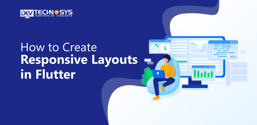
As a cross-platform app development framework, Flutter works on devices of all sizes. It can be used from a small smartwatch up to a large TV. The same codebase is not always able to adapt to a large range of screen sizes or pixel density.
There are no rules that you must follow to create responsive layouts in Flutter. We’ll discuss some approaches that you can use when designing a responsive layout. Let’s look at the native layouts of Android and iOS before we start building responsive layouts with Flutter.
What is Responsive Design?
Responsive design (user interface), also known as adaptive design, is a design method that allows web and mobile apps to adjust their layout to the screen size or device. No matter the device or screen size the user is using, responsive UI attempts to give them the greatest viewing experience possible.
Responsive UI is a feature that allows a mobile application to adapt its layout, font sizes, and other elements in order to fit on the smaller screens of smartphones or tablets. The app may display a single column of content on small screens but switch to multi-columns on larger screens. This will help to ensure that your app is easy-to-use and offers a great experience across a range of devices.
In web development, a responsive user interface allows web pages to adjust their layout, font sizes, and other elements according to the size of the browser window or device on which they’re being displayed. This ensures that web pages can be read and used on many devices, from desktops, laptops, smartphones, and tablets.
Why is Responsive Design Important in Flutter?
A responsively designed Flutter app has various advantages. Your application will be more appealing to a larger audience if it is consistent across all screen sizes. Tablets and other smaller mobile devices will enjoy a customized user experience.
A responsive design will also increase the retention rate of your application. You must create responsive layouts in Flutter because Flutter is an excellent choice for both web and mobile applications. It ensures that your application’s appeal is consistent and users get a seamless user experience no matter what device they are using.
Incorporating responsiveness in your application will also help you avoid negative ratings. Over 2 million apps are available on the App Store and over 3 million on Google Play. Reviews are the most common way users choose which apps to download. You want to get good reviews. You should therefore include responsiveness in your app development checklist.
Why Should Your Flutter App Be Responsive?

Any mobile device, tablet, or TV screen can run a Flutter application. Apps must be able to accommodate the many screen sizes and resolutions that are available today. The apps should also adjust to landscape and portrait mode when the user rotates their phone. It isn’t easy to cater to all the user needs, so it is essential to create responsive layouts in Flutter, responsive enough to ensure that they meet them.
Flutter Responsive App Examples:
The following are some of the most popular responsive web applications made with Flutter.
- With the help of the mobile app Google Ads, you may control Google Ad campaigns from your smartphone.
- Reflecting is an AI-powered journaling app that combines cognitive behavioral therapy with positive psychology to help users cope up with daily stress.
- It’s a smartphone application that simplifies ordering food for delivery. This is one of today’s most popular food delivery apps.
- Watermaniac is a lightweight application for monitoring water consumption, built using the Flutter framework. It helps consumers keep track of their daily water usage.
- With the aid of the Flutter app Cryptograph, you can keep track of the most recent changes for more than 1600+ worldwide cryptocurrencies, including Bitcoin, Ripple, Ethereum, and others.
Is Flutter Responsive By Default?

The responsiveness feature is disabled by default in Flutter apps. Developers can choose to create responsive layouts in Flutter or Adaptive. There are two design approaches that developers use when designing mobile apps using Flutter: adaptive design and responsive design.
Adaptive design involves designing separate interfaces to accommodate different screen sizes and devices. A smartphone and tablet would have different layouts if you used an adaptive design.
With adaptive design, the app will detect your device’s size and load the layout that is appropriate. This can provide a customized experience for different devices but can be difficult to maintain and design.
In contrast, responsive design is a design method that creates a single layout that can be adapted to different device sizes and screen sizes. The app will then adjust its layout to the screen size.
This can provide a consistent experience on different devices and can be easier to maintain and design. It may not provide the same level of customization as adaptive design.
Flutter allows you to choose between adaptive and responsive design.
The decision between adaptive and responsive design depends on your app’s requirements and your users’ preferences. If your app is aimed at a particular device or screen size, for example, adaptive design might be a better option.
If you’re looking to make your app accessible across a range of devices, then responsive design is the way to go. It can be done with the help of experts. So you must hire dedicated developers who can make your application accessible to all devices. Your demands and those of your audience will ultimately determine whether you choose adaptable or responsive design.
Android Approach
In order to create responsive layouts in Flutter, Android uses the following concepts to accommodate different screen sizes and densities:
-
ConstraintLayout
ConstraintLayout was one of the first revolutionary tools in Android UI design. It allows you to create responsive layouts in Flutter and is adaptable to different screen dimensions and sizes. ConstraintLayout lets you specify the size and position of each view based on the spatial relationship with other views.
This does not solve the problem of large devices where stretching or resizing UI components to fit the screen is not the best way to maximize the screen space. It also applies to smartwatches and other devices with limited display real estate.
-
Alternative layouts
You can fix the problem above by using layouts that are different for each device size. A split view can be used on tablets to maximize screen space and provide an excellent user experience.
Flutter layout in the Android studio allows you to define different layout files for various screen sizes. The Android framework will switch between these layouts based on your device’s size.

-
Fragments
Fragments allow you to separate your UI logic and create separate components. This lets you avoid having the logic defined separately when designing layouts with multiple panes on large screens. You can reuse the logic you defined for every fragment.
-
Vector Graphics
Vector graphics are images that are defined as paths and colors in XML files instead of pixel bitmaps. They can be scaled without causing scaling artifacts. VectorDrawable can be used in Android to create any type of illustration.
iOS Approach
Here are the concepts that iOS uses to define responsive layouts.
-
Auto Layout
Auto Layout allows you to create adaptive interfaces. You can do this by creating rules (also known as constraints) that govern the content of your app. Auto Layout adjusts layouts automatically when certain environmental variations are detected (known as traits).
-
Size Classes
Size classes are attributes that are assigned to the content areas according to their size. iOS dynamically adjusts the layout of content areas based on their size classes. Size classes are used on the iPad when your app runs in multitasking mode.
-
Some UI Elements
On iOS, you may also utilize UIStackView, UIViewController, and UISplitViewController to build responsive user interfaces.
How is Flutter Different?
You should be able to understand how responsiveness is handled natively on Android and iOS by now, even if you’re not a developer. Android Fragments are reusable components that can be run within an app’s activity. Multiple Fragments can be run within an Activity but not within multiple Activities.
UISplitViewController, which handles child view controllers in a hierarchical interface, is used in iOS to control multiple view controllers. Now let’s talk about Flutter. In Flutter, widgets were first introduced.
They are essentially the building blocks that can be connected to form an entire application. Remember that every screen in Flutter is a widget. You won’t have to learn new concepts to create responsive layouts with Flutter, as widgets are reusable.
How to Create a Responsive Flutter App?
In this section, we will discuss how to create responsive layouts in Flutter. For this, you need professional assistance, so you should hire web developers for better results.
1. Media Query
You can use Media Query to find out the size and orientation of a window in real-time (portrait/landscape). It gives the size and orientation of the app. It is useful when you want to make a decision based on a complete context rather than the size of one widget.
2. Layout Builder
Layout Builder is a simplified version of Media Query. Media Query differs from Layout Builder in that it is based on the entire context of the screen rather than the size of a widget. Layout Builder, however, only determines the maximum height and width of a widget. The Box Constraints class is provided by the Layout Builder to determine the maximum width and height of a widget.
3. Orientation Builder
The orientation of a widget may be determined using the OrientationBuilder class. The Orientation Builder widget has a similar interface to the Layout Builder widget. The builder property in the OrientationBuilder classes can be used to get the Orientation object. You can, for example, use the OrientationBuilder to change the number of columns in GridView.
4. The Expanded and Flexible Widgets
The Expanded Widget and Flexible widget can be placed inside the Row, Column, or Flex widget to allow their children to have the ability to fill up the space available. The only difference between Expanded and Flexible widgets is that Expanded requires the child to use all of the space available, while Flexible does not. Expanded widgets and Flexible widgets are also useful to create responsive layouts in Flutter that use percentages rather than hardcoded values.
5. Aspect Ratio Widget
Aspect Ratio can be used to size a child according to a certain aspect ratio. The size of an app is not important when developing it, but the aspect ratio must be considered. AspectRatio helps you by sizing your child’s value according to the aspect ratio. This ensures responsive design with Flutter.
6. Fractionally Sized Box Widgets
When the design calls for relative dimensions, fractionally sized widgets can be useful, fractionally sized widgets are useful when the design calls for relative dimensions. For instance, if a button occupies 80% of an app’s width, but the margin only takes up 10%, it can be helpful. This Fractionally-Sized Box can be wrapped in a flexible widget to play well with either a row or column.
7. Custom MultiChild Layout Class
A delegate is used by the widget CustomMultiChildLayout to determine the number, size, and placement of its children. This delegate defines the layout constraints for each child and determines their position within the parent widget. The delegate may define the size of the parent widget, but it cannot depend on the size of its children.
When there are complex relationships between the placement and size of several widgets, CustomMultiChildLayout is an appropriate option. You need to pass a delegate argument that is of the type Single Child layout Delegate.
This argument will be used to set the layout and constraints for the child. You need to create a Custom Class in order to extend Single Child Layout Delegate since it is an abstract class.
Is Flutter Still Relevant in 2023?
A popular cross-platform mobile framework used by many developers worldwide is called Flutter. Statista’s survey shows that 42% of developers are using Flutter today. Given the simplicity of usage and implementation, this number is anticipated to rise.
Flutter will still be relevant in 2023. Flutter is a popular framework that has grown in popularity since its launch. It has also become the preferred option for developing cross-platform mobile applications.
Additionally, you can create responsive layouts in Flutter. Flutter’s ability to produce visually pleasing and high-performance apps using a single codebase is what makes it so powerful. The vibrant community of Flutter and its extensive ecosystem continues to flourish, offering developers a variety of packages, tools, and resources.
Flutter’s integration into Fuchsia – Google’s open-source operating system – further cement its future potential and relevance. Flutter will continue to be relevant in 2023 as long as it continues to improve and adapt to changing developer needs.
Conclusion
Responsiveness is required for consistent UI design. With only a few lines of code, these packages make it simple to do a lot in that area. If you haven’t tried this before, maybe you can investigate this in your future application and complete the task much more easily. However, it would be better to take assistance from a web development company that can help in making your app’s layout responsive.
FAQ
What is the Best Method to Create a Responsive Design?
Media queries can be used to get sizing data and determine what you should do. For example, different screens are needed for desktop, tablet, and mobile.
What Are the Features of Layout Builder Flutter?
Use the builder function in these circumstances:
- The first time the widget is assembled.
- If the parent widget meets various layout constraints.
- This widget is also updated when the widget parent is updated.
- The builder function will change when the dependencies it subscribes to change.
What is Layout Build Flutter?
The LayoutBuilder widget is similar to Flutter’s Builder widget in that it calls the builder during layout. It also provides the widget constraints of the parent widget. This is useful when the parent restricts the size of the child and doesn’t rely on its inherent size. The ultimate size of the LayoutBuilder will equal that of the kid.


